
A design that says everything says nothing
A very common mistake: trying to cram every service and every product into the stand so "visitors see everything." The result is a visually crowded stand with no clear message. A successful stand focuses on one strong message, not a full catalog display.
Circulation space matters more than display space
Many companies put the whole budget into visual design and forget that visitors need room to move and engage comfortably. A stand crowded with furniture or displays makes visitors walk past it without even stepping in.
There's no plan for the first 10 seconds
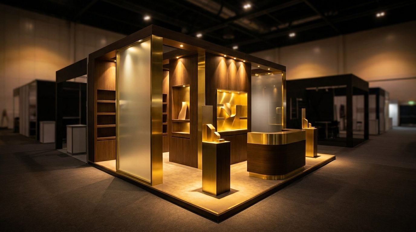
A visitor decides in seconds whether to stop at a stand or not. If there's nothing clearly eye-catching from a distance — not just a sign, but a shape, lighting, or interaction — the stand gets lost among dozens of others.
There's no plan for after the show
The biggest waste doesn't happen in the design — it happens after the event. A beautiful stand that collected visitor data with no clear follow-up plan is money that just disappeared. There needs to be a clear system for following up with every interested visitor before the show is even over.